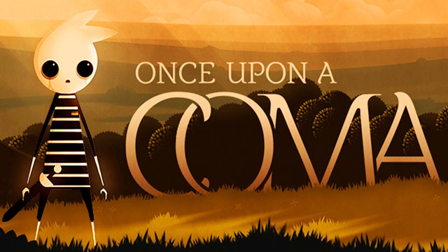
 Sometimes, a small shift in perspective can breathe dramatically new life into a story. Enter Once Upon a Coma: Chapter 1, a partial reboot of the previously rave-reviewed Coma. This short teaser once again follows Pete, the young boy who woke up from a coma only moments ago, as he attempts to piece together what happened in his life and to his family.
The style and plot are reminiscent of the way children synthesize imagination and reality. Soothing, ethereal music; quaint storybook animations; and a feeling of "one of these is not like the other" put players in a daydream-like state, which fits appropriately with the task at hand. We are just as disoriented as Pete and know only as much, asking questions and threading pieces together alongside our little hero. As the story develops, we become increasingly invested in Pete's adventure, and by the end of Chapter 1, we have cemented an undeniable bond with him.
Despite this game being a remake of the original Coma, an alternate game design and a bit of extra dialogue make a huge difference in both the ambience and how the story unfolds. I would highly recommend playing Chapter 1 all the way through, then going back to play the original and compare how dynamically divergent the two are despite a shared inspiration.
If anything could be improved in Chapter 1, it would be the user interface. Though Thomas Brush's design skills have increased drastically, game navigation and interaction are less clear and less intuitive than in Coma. Without an explanation for game mechanics on the load screen, players' first impression of the game includes some confusion and perhaps frustration. Closely clustered controls and a directionless gameplay make it challenging for players to determine whether they made a mistake; missed a clue; or are simply observing a feature of the game. As such, Brush lost out on further opportunities to either enhance the gameplay or drive the plot.
Nevertheless, Once Upon a Coma: Chapter 1 is a wonderful way to simply appreciate art and jump - if only for a couple minutes - into a small fantasy world.


I would probably have enjoyed this a lot more if I could get past the title screen. I've tried reloading, I've turned off all my plugins and whitelisted the site, I've opened it in private mode, and I haven't been able to see anything but the very first screen that loads. I've mashed every keyboard button and clicked everywhere I could. Still nothing.
It sounds pretty, but other than that, I'm really disappointed it won't work for me.
Start of the game is a bit confusing, you have to click the game window (the cursor disappears inside the gamescreen)and press space bar.
You should remove the Smiley for the content icon. There is some pretty crude dialog.
Hello, I changed it.
Update