![]()
 The reactions people have to art games versus "regular" games is a lot like the reactions people have to art cinema versus popcorn movies. On the one side, people who like it will praise it for being challenging, satirical, intellectual or evocative. On the other side, many people slam art games for being cliched, melodramatic, pretentious, and covering up for a lack of game-making skill. So it's a "love it or hate it" thing, and the dichotomy doesn't get much more stark than in the works of Jason Nelson, probably best known for game, game, game and again game. Probably because while many art games can at least be enjoyed aesthetically, his works are aggressively ugly.
His latest piece, Scrape Scraperteeth, was sponsored by the San Francisco Gallery of Modern Art. If you're the kind of person who wouldn't be caught dead going to visit a museum of modern art, or who says things like "my kid could do this" about its contents, you're definitely going to fall on the wrong side of this game's reaction dichotomy and you might as well scroll past this review now. The rest of you should play it to see what you think.
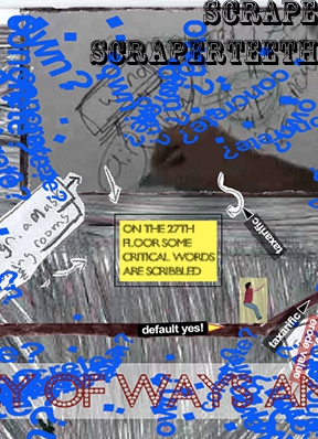
Scrape Scraperteeth actually has you start out the game by reading and acknowledging a satirical "warning", pointing out its flaws before the critics can do so: it's easy (you can't die or fail), it's ugly (well... just look at the screencap), it's strange. Once you acknowledge the warning, the rest of the game plays by the same platforming mechanics you know and love: [arrow] keys to move, and [spacebar] to jump.
Eventually, unless you give up, you will get to the end. If you try to apply usual platform game logic and get there as soon as possible, the game's going to be over very fast and you'll be leaving a scathing comment here about the muddy movement or poor level design. Platforming enjoyment is not what you're signing up for when you play this game. Slow down and take the time to watch all that happens as you move around the levels, to read the text, and to figure out the subtext. On the other hand, while the game goes ahead and tells you on the menu screen that this game is "about the real estate crash", it also says "stop trying to 'get it'". So maybe you should just let the cognitive dissonance wash over you like metal on metal. Not for everyone, but it might be for you.


It may be an art game, but in the last level if you go left it'll reset the game. For something sponsored by a Museum, it should at least keep some standard of programming quality.
I wish I could read it all, but I did think the "wind of meetings" blowing you up the hill was pretty dang funny.
I think I gave it the worst possible grade - average.
I (think I) know what art is and I'm aware of immense multitude of possibilities to express oneself. And I appreciate Nelson's work as such and I'm aware real estate crash is important, complicated topic.
BUT, the sort of rhetoric which implies if I don't like it, then I don't get it (either it's "the ugliest" or "the most beautiful") - is a bit troublesome. And tiring to me personally. Misunderstood artist is a cliche after all (http://tvtropes.org/pmwiki/pmwiki.php/Main/TrueArtIsIncomprehensible).. Not that I don't like/get arty games, work of Gregory Weir or Every day the same dream e.g. touched me deeply, but I just don't like dadaistic (is it?) expressionism. I just don't "get down with it", not that I'm incapable of anything but stubborn materialistic rationalism..
Exactly the same artistic merit, aesthetic appeal, game quality and ideological depth of the rest of his work. Which is to be expected, really, as if you spliced random scenes from his various games together you'd hardly notice.
What a piece of fecal matter.
This is the worst thing I've ever seen. It's not just that it's messy and incomprehensible, it's also badly made. And art game or not, there's no excuse for that. It's like Jackson Pollock spills coffee on one of his awful paintings and says, "yeah, that's part of it too."
Unfortunately, this one didn't speak to me. Really gave it a try, but simply got bored around the fourth screen. Walked through the experience twice - more out of a sense of obligation than anything else. Didn't get anything additional out of it the second time, aside from a sense that the author was more interested in exercising his new toys than in connecting in a meaningful way with his audience.
I feel like this guy hates his own work, no love for his own art.
I managed to die. Fell off the world in world 4 (or maybe it was 5), and the game restarted from the warning screen. My desire to play the game died with the character, and it wasn't missed.
Self-deprecation isn't an excuse for making a bad game, by the way. There may be a meaning buried within that I missed, but I get the feeling that the author just threw something randomly together in the hope that players would insert their own. Then again, maybe that's the intended meaning, and maybe that's me inserting meaning where there's none. Etc.
Anyway, I wish there was another term for this kind of game besides "art game". Not because this isn't, but the term excludes all other games from being art by omission. Art doesn't have to be impenetrable crap like this, it can also be beautiful, working in concert with game mechanics in stead of against them, even fun and actually meaningful.
I think it's just a trick; The author doesn't actually create art (or at the very least not this time), he just released a pile of random with a few vaguely relevant real-estate terms...
Bet he just wants to see who genuinely views it as art and who praises it's "influences" and "undertones" to hide the fact that they can't see the art in it, like they might be thought less of if they didn't comprehend it's artistic merit.
Other than that I can't make any points against the supposed artsiness that the people before me haven't =)
I'm not dead, nor have I failed. I'm merely stuck in the first screen with random words flying around and my character not being able to move a single inch from its initial position. 1 mushroom?
Some of these comments are painful to me... "art" games aren't supposed to be what you would expect a game to be. Playability is not the point. The point is the creator managed to take the same methods used for game creation and do something somewhat original - something more than just a game. I'm not saying this is the best "art" game I've ever played, but I always appreciate attempts to do something different.
Games are things you play. For a game, gameplay must be good, or the game will fail. Art is not necessary supposed to satisfy your need for play (although it can)- it is supposed to make you think. When you discredit games like this you let people like Roger Ebert win.
Sorry for the rant. The random scribble explosions were my favorite part.
Vertigobee:
If it were good as art, the game aspects would be largely irrelevant and we'd be heaping praise on the author. The problem with this piece isn't the gameplay. I'm glad the author tried to do something different. Unfortunately, in this particular case I feel he failed. It would do a disservice to everyone involved for us to blindly laud any art game merely because the author tried.
RE: game end message
email with the subject:
"sudden is the scraper and something wondrous might happen" ...
I`m not going to be invited to a timeshare presentation weekend, am I? ;)
This... is terrible.
I am completely reminded of 'Sweet Bro and Hella Jeff', the irony-soaked deliberately-crap webcomic featured in MSPaint Adventures.
yeah, okay, this is deliberately 'aggressively ugly', fine whatever. It's also a ridiculous, jumbled mess of trying-too-hard colliding with desperately-struggling-for-relevance.
It's just a bunch of absolute nonsense exploding onto the screen and crashing into each other accompanied with a distracting and ultimately meaningless word salad.
There is no meaning here, unless it is "hah hah hah, video games are crap."
Vertigobee:
I'm sorry, but that's just the most fabulous lie I hear on a pretty common basis. Art has, and has had for as long as it's been art, standards. There are very objective standards used by critics, teachers and artists that tell them when art is "good" vs. "bad".
In static visual 2D pieces, we have the use of negative space, the way a line draws the eye, color composition, etc., etc.
In film, we have the idea of narrative flow, the acting conveying a believable emotion, theme, use of static or moving camera, camera angles, and so on.
Gaming as art is a young medium, but it also too has some standards. Firstly, it should make you think about an issue, generally unrelated to gaming. The thought, incidentally, should not be "what is this merde?" Secondly, the gameplay should be either shockingly easy, a mere vehicle for the message (Every Day the Same Dream), or say something about gaming or be consistent with the message the game wants to convey (You Have to Burn the Rope).
To merely say anything, in any medium, that is shocking or new, or labeled "art" is to cheapen the work of people who actually put a lot of thought and emotion into their work, and many years honing skills that make that work into art. In this case you are mistaking Troma for Kurosawa, Rob Leifeld for Monet.
The problem with this game, and all games by the same author, is the sense that if you critique the game by any normal standard, that they will hide behind the "It's art, man, I don't have to explain it! You just don't get it!" argument, which is, and always has been, so much smoke screen and obfuscation.
Truthfully, the game's author themselves does not "get it", and I hope someday they put their passion into making something of real meaning and artistic value, rather than re-skinning everyone's favorite plumber game with "shocking" imagery and knocking off for whatever the gaming equivalent of an opening gala is.
Isn't art supposed to be:
A - nice to look at
B - convey some deeper meaning, some "great truth"
C - inform/entertain
D - have relevance
E - and so on?
I gave up. There should be an epilepsy warning or something. This just HURT my eyes and my ears. I give it a 1/5 because I can't give a 0/5.
I think this is art because it is making you pretentious jerks whine at each other. Looks like it worked!
to those of you who can't see the art in this, i wonder if you understand poetry, or for that matter, any abstract artwork. ever.
i mean really...imagine if no one ever tried anything new.
Update