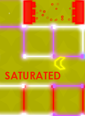
 Winter grays getting you down? Maybe you need to brush up on your color wheel? Saturated will brighten your world with neon vector graphics and brain-challenging action-puzzles. You'll definitely never forget that red and blue make purple after your failure to apply that principle in time results in your ship being reduced to smithereens.
Control of the ship is done with the [WASD] keys, shooting with the mouse, and the color of your ship can be switched by using the [space] bar (or the center mouse button, if you have one).
There's a good variety in the levels here. Some levels require frantic speed to outrun a laser, others are mazes requiring exploration and backtracking, and still others are enemy-heavy.
The throbbing electronic soundtrack has a good variety too, but unfortunately, there's no mute button. There's also no way to lower the quality, so if you don't have a top-of-the-line machine, you might notice lag during the more sprite heavy times, which are usually the times when you least want lag. Of course, since the game depends so much on color-blending, the color-blind will not be able to enjoy it. Also, be careful where you click, as clicking "more" at any point opens the game's Facebook page in a new tab, which you might find as irritating as I do.
With those caveats, it's certainly a fun little diversion. Now if only I could turn the slush outside my apartment some nice, cheery colors...


Sweet! First comment AND first vote! Nice game, by the way.
The game runs too slowly on my 2.4GHz machine. Huge waste of processing power. Inefficiently programmed.
Out of curiosity, atomic, what browser are you using? If it's Firefox and you have other tabs open, try playing without any other tabs open. Or try using Safari or Chrome.
I thoroughly enjoyed this game, except for the chase sequences. The insta-death walls and weird detection on the corners made them an irritation in an otherwise pleasant and relaxing game.
Does anybody know how many levels there are in total? Thanks.
12 Levels total, by the way.
In the final boss level,there was no gate over the exit door, so I went right through without beating the boss. Did that happen to anyone else?
I had that happen too Aurora. Thought I'd just discovered something, but now I'm sad that I didn't get to fight the final boss.
Game concept is totally not bad even if the puzzle elements are defintely too poor and the fightings definitely too easy.
Anyway I have a complain towards the linked webpage the game is hosted in, that happens to be made by JIG staff itself.
If by mistake I click outside the screen (and it sure happens a lot with my touchpad) I click on that annoying ads on the sides and the page ISN'T opened in a new tab.
So it just happens I have to click back and open up my game page again. I definitely can have my browser open up links in new tabs by default, anyway most people just wouldn't feel like it.
Instead I definitely suggest JIG to change the code to open up in a new window. That would not make this website lose revenue for the ad clicks and won't make people rage either (so they may even be more attracted to the sponsored page too).
I'm also a bit annoyed about the ads being too big or too adiacent to the game window, but I guess that is totally reasonable on a website that hosts free content, so I can totally live with it :)
[I apologize for that, Danaroth, but the opening a new window behavior is not something I have control over. It's up to Google. -Jay]
So I wasn't alone... I, too, just sauntered past the boss (though I took out the outer color shell first). And two levels before that, I flew through a wall (somewhere near the end) and somehow beat the level.
In addition to those bugs, the controls are clunky (inability to stop in time), and occasionally lagged on me - I'd stop pressing keys, and my controls would continue being executed for 2 or 3 seconds. Interesting concept, but way too many bugs and problems.
I found myself lagging only on the maze level, other than that it ran fine. Getting stuck on the occasional corner wasn't that bad, until it happened repeatedly on the second level where you get followed by the line of death. It was fun though, and a nice concept.
Wish it was longer. Maybe make "Saturated 2: Supersaturated", with less edge-catching, more colorific puzzle-shooting, and a heaping lots more of levels.
Great idea. There's a lot of potential here. I just wish the ship wouldn't get trapped against diagonal walls. It should slide instead. I can understand a speed penalty, but if you're going to make it so the ship is invulnerable to wall collisions, then the player should always trend toward whichever cardinal direction is being pressed, while the ship is against one. I notice it does this fine with north-south and east-west walls, so doing it was diagonals would be the next logical step.
I died so many times because the ship treated diagonals like barriers.
Oh yeah - and there's a bug on "Passageways". The game lets you shoot locks while on invisible door thresholds, causing you to become trapped inside the the door as it materializes.
I was a bit nuanced by the chases. But all in all, an excellent concept!
Glow effects are way overdone. It just ended up being blurry now.
Again, non-qwerty people can't redefine keys..
And I can stop music..
But I liked this game, thanks.. :)
non-qwerty people can use arrow keys. you still have arrow keys, right?
That was kinda fun until "Run!". Then I quit. Oh and it definitely made my CPU race, and it wasn't anything else doing it, because shortly after closing that tab, we're back to purring. And things did start getting a little bit laggy during that level too. Oh well. Ooh, sorry that rambled a bit :)
Strong concept, reminiscent of dE BLOB on the Wii for the color mixing. I liked the eighties neon-and-techno feel.
People's complaints about the controls are spot on, however. They just aren't quite as responsive as I'd like them to be for the action-oriented levels. It is also IMMENSELY frustrating to get stuck on the walls due to spotty collision detection when you're attempting to outrun the White Glowing Bar of Doom.
I'd also like to suggest a music shift during the maze levels. The driving techno is great when your fighting baddies, but a more contemplative tone would better fit the maze and other puzzle-solving levels. Between the urgent music and the ship constantly sticking to walls, I found it hard to enjoy the areas focused on exploration and experimentation.
Maybe I've just been a lighing techie way too long, but this would have made so much more sense if they used Red, Green, and Blue instead.
Pretty fun, though
I played a prototype of this game at the Penny Arcade Expo (PAX) in September... so I can't really be bothered to play through it again. And I'm realizing that I really don't like WASD as a control scheme, but playing with my left hand on the arrow keys also feels odd.
Looks pretty, neat concept.
Update