Polarity
 Borrowing a page from the book of Ikaruga, the absurdly talented developers of Stimunation Games have just released this stunning Flash shooter that will make your jaw drop and your eyes water from ogling the screen for hours.
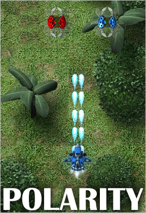
Polarity is a top-down shmup with enemies of two polarity types: red and blue. You control a ship that can switch between these two polarities for both offensive and defensive advantages. Fire at enemies of the opposite color for an offensive advantage since opposite color enemies will take more damage from each shot. When fired upon, match the polarity (same color) of the incoming shots to have your shield absorb them and leave you unharmed.
Control the ship using the arrow keys, or with the [W],[A],[S],[D] keys. Fire your weapon by pressing [space]. Switch polarity by pressing [B].
The game contains lots of enemies and boss fights, too. Collect coins for points, and the occasional power-up to temporarily upgrade your weapons or shields. You begin with 3 lives and 3 continues. Receive an extra life for every 100,000 points you earn.
Analysis: Just two words: absolutely gorgeous. The graphics in the game were created from 3D modeling programs, rendered and then imported into Flash and optimized. As pretty as it is, though, some of the background tiles actually look like tiles, but that's a relatively minor complaint. The frame rate is unbelievably smooth considering the detail of the art and the on-screen action happening all at once, though your mileage may vary. This is one amazing Flash game engine!
The only thing I don't care much for is the keyboard controls. I have a difficult time perfecting the polarity switching with my fingers on the keyboard, but that's just me. This game feels like a console game and it would certainly benefit from the use of a console controller. Of course anyone can use a program like JoyToKey or other similar program that allows you to map keyboard keys to gamepad buttons.
Polarity was commissioned for Wrigley's Candystand website and is, in fact, an advergame for Eclipse gum. But the advertising is done tastefully and it integrates well into the space theme of the game. The advertising is not startling, but it is rather effective. The product placement is just enough to get you well acquainted with the Eclipse logo for your next shopping trip. Overall, exceptional in almost every way. More stimulating stuff from Stimunation!
Cheers to Rydash for helping with the review. =)


its really hard. the ships to slow and you are fast.
Yeah, it's pretty, but man it doesn't have very high replayability. Something as chunky and narrow as that should really give you more of a health level before losing a life. I will state up front if I lose 2 lives in the first 10 seconds because I nick a ship, I stop playing it. Having watched Dogfights on The History Channel, I know fighter planes can take some damage and this "one shot one kill" thing is just dang annoying.
Also not a fan of power ups that change when you shoot them. When I'm kneeling on my space bar, I truly dislike having to pause to see what temporary power up I might get. Especially during a swarm.
As to the polarity shifting, I didn't do it until the first and second boss. I was blue the whole time. I just shot more red guys and let the blue guys shoot me. I think given more time to build this, they'd have a power meter for blue and red and you could use either power up as a special weapon (V and N keys since they used B to shift.)
Overall, yeah, it was pretty, but I've played better...more forgiving shumps.
The main problem with the game is that each ship is rather big and clunky, and no matter what form you are in they take a few shots to take out, and while you're mowing down one side of the screen you can do nothing to the left side, leaving them free to shoot you.
Furthermore, no matter what color you are the enemy ships can destroy you if you bump into them, and instead of letting you keep going when you lose a life, it has to stop and restart after every death, instead of a smooth transition to your next ship.
The improvements I can think of would be smaller ships, an Ikaruga style bullet eater attack, and have your ship move much faster. Also, like in Ikaruga, it would be good to have choreographed enemies and bullets shot out, because in that game switching colors was easier because there was a pattern of sorts you could memorize.
first of all, i already sent a mail to say thanks but yup, wanted to say it in public again,thanks heaps for this very nice review Jay, your indepth views on things are a great benchmark and when you cheer something up it counts, makes up for lots of worked through nights =)
now to xadrian:
I'm sorry you seem to not like the game a lot,yeah,it has classic arcade space shooter type gameplay (so like in some of those you also die with one hit for example), either one likes that or not.
To my experience it gets way easier once one is used to the powerups and switching shield colors though.
The same could be said about the switching powerups feature, its really personal preference; i like it to be able to have a bit of influence on which powerup i get :)
I kinda like your power meter idea but yeah,dunno if it would have been good to make the game need two more keys, it already uses enough keys as it is, no? :)
And regarding the point if this or that feature would have been added with more dev time on it, yeah,maybe we'd have added something more here or there, but after all the client believed in us and the project enough to grant us quite a long dev time and we've said its finished once we were happy with it (and that was after quite a while ;) ).
Tom,
Don't get me wrong, it's a good game, just a few things, like you said, "personal" that are keeping me from thinking it's a great game. I'm stuck in the era of X-Wing vs. TIE Fighter and long for a decent space combat game, so my standards are a bit high and archaic.
It is a well crafted game, that's for sure.
Nice! Although the playfield does seem to be a little bit cramped considering how easy it is to nick an enemy ship due to their size, but this mainly happened to me when I tried to rush to a power-up.
After a little experimenting, I think I found myself to be most comfortable with the following control setup:
Movement = W, S, A, D
Fire = (Right-hand) Shift
Shield = Return
Pause = Backspace
Hey, the voice that tells you what power-up reminds me of an old 'shmup' game called Project X that I used to play...
Thanks for the great write up mate, first one of my games you've mentioned since I left preloaded ;)
Nice to hear the name "Project X". I think it was Alien Breed's speech that inspired me to try and drop speech into a game whenever possible.
Few comments about it being difficult. When describing it during development I always likened it to "Who wants to be a millionaire", in that we wanted it to feel like we were giving the player every chance to progress.
So for example, at any one time only half the bullets on screen are fatal to you. Chapter 2 onwards the power-ups are dropped a lot more often etc.
In saying that, it isn't easy, but repeated plays do make it feel a lot more natural, and there are lots of ways to make the shield work to your advantage ( eg, you can do a "Sweep", where you just absorb all the bullets of a certain colour quickly, and then just swap shield colour, that gives you more time to deal with the actual baddies ).
It's not going to be everyone's cup of tea, and life's too short for me to try and defend it's weaknesses. I think for what it is, it's pretty damn good. There are always areas for improvement, but that's why God invented sequels :)
Squize.
to Pyros:
The enemy ships take less shots to take out when you shoot em with opposite color than their main body color :)
I don't like the thought a lot to make all ships some smaller, i'd prefer making the game area bigger but yeah, there are some technical limitations we have to live with for now, so yup, maybe in a part 2 in the next flash version :)
I'm not really a fan of the thought that one should be able to bump into enemy ships without any problems, i'll think some more about that, at the end that change alone would remove lots of the classic arcade game feel, which is about rewarding gamer skill to master avoiding enemies and their bullets,not bumping into them :)
You've got a good point regarding the transition when you die, we'll probably make that shorter in case we should do a second shmup game later.
I also like the bullet eater though, yup, we've had discussions whether to add that but then decided to go for various powerups instead than limiting it to one strong counter attack you can do.
I'm no fan of totally patternized enemy movements and attacks though like you said, i think good skills should be more important than pure memorization, but sure, another one of those points where opinions may vary :)
to Xadrian: no problem, i apreciate your feedback, we always consider all feedback in our discussions on games, it just helps making the next game better :)
Overall i'm glad with what we achieved, though sure, there's always room for improvements.
to Tayrin: yeah,the playfield is cramped with lots of stuff :) as i said we'd like to make the play area bigger and once its possible on the technical side while maintaining a smooth framerate in an action paced game like this, we'll do it :)
Nice setup you got going there :)
and yup, we tried to give the voice over a feel like in classic games :)
Hey Tom, thanks for the reply. :D
Hmm, despite my saying that the playfield sometimes seemed cramped, I think the size of the ships is good as it is right now. It wasn't very often that they troubled me too much. They are pleasing to the eye, and large enough to show a nice amount of detail! Also, I like the huge boss ships. :D Lots of fun!
So far, I have only reached 62% game completion. Unfortunately, when I got that far, the transition screen between levels seemed to freeze on me. The Loading bar at the top right stayed empty; the square next to it continuing to flash. I waited a good few minutes and more, but nothing happened. :( I'm not sure what caused it, but, so far, I think the difficulty level has been just right! I don't know whether it gets tougher later on, but if there's not a huge jump in difficulty, I think it'll be just fine. :)
Hey Squize! =)
Yeah, I almost mentioned how cool it was to be able to actually play through the game without having to fail so many times first. That was a real joy and something many games seem to want to withhold from the player. There's plenty of incentive to go back through to rack up higher scores, and yet the simple enjoyment of just playing through the game is quite gratifying in itself.
The only thing I would change is to perhaps offer unlimited continues. =)
I, too, thought the play field was a little cramped at first, but that feeling went away after playing for a few minutes.
the main issue i had with this game are the controls
i play on an azerty keyboard and the movement controls just don't work for me (they do work, just not for me)
Bart - just open up settings from the game's menu screen where you can set any game function to any key on your keyboard.
I didn't mention it in the review, but should have. :x
my only real complaint with this game is that the hitbox is EXTREMLY huge >_
It's a copy of an actual game. I can't remember the name offhand, but the original game was for the PS1/PS2 and was dealing with Black/White. It was released in english very rarely and was mainly an offshore game. In that one, you could pull a power shot by absorbing enemy shots of the correct colour (I believe the same as you were). It was an awesome game. If I could only remember the name of it (It used to have a youtube video of a playthrough)
Kitsuna - I believe the game you're thinking of is Ikaruga (as I mentioned in the first sentence of this review), and it was released for Dreamcast and GameCube, not PS1 or PS2.
Hmmm. Not bad, though it does need a bit more work. A couple of thoughts:
On collisions--why not extend the colors to this as well, and have it so you're immune to collisions with the opposite color (I was thinking immune to collisions with the same color, but then there'd be no reason to switch, and you'd be able to just ignore half of the enemies).
On known patterns: While I can understand not wanting to make things completely predictable, this is kinda what the whole point of the chaining counter is for--as it stands now, the two colors are so evenly mixed that it's hard to get a long chain unless you specifically ignore half the enemies, while trying to avoid either colliding with the color you're not targeting, or worse destroying one of your same color, which kills your chain...
If you still have the computer you played this on, it could be used to save this game with the web cache on it. If you do have the game, contact me at my email ([email protected]) or on Discord at Computerdude77#3004
Update