 Who doesn't remember trying to beat Breakout on their Atari? Er, maybe at the arcade? On your computer, while procrastinating on your final papers? How about on your cell phone on a long train ride? I have all those memories, though most are the latter ones. But no matter when or where, we know exactly what to expect when it comes to Breakout.
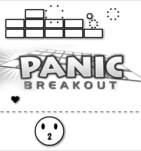
It's all there in Panic Breakout from Taro Ito's GameDesign. Just add a big ol' round smiley face as the paddle, more than one ball, and falling powerups. Start by left-clicking and one ball shoots into play. Use the entire face, sides and all, to keep the ball going, while also trying to collect hearts, stars, skulls and more dropping from the destroyed bricks. The wall gradually marches down the screen — faster and faster on higher levels — so work quickly.
Hearts are extra/spare balls and they're vital to staying in the game. After collecting them, release the balls at any time with a click. The number collected serves as the face's mouth, whether it be one or five, and they'll all be released once you run out of balls in play. The game ends if the ball(s) sink and there are no more left in reserve — with the face making a panicked-looking :-0 — or the bricks drop past the dotted line.
The letter Ps enlarge the smiley-paddle and skulls shrink it down a size. Cinderblocks cause a line of blocks to appear at the bottom of the screen, preventing any lost balls for a brief period. Stars speed up the balls in play a little, which helps clear those bricks before they advance too far, but also makes things more hectic.
Analysis: If you're used to the simplicity of basic Breakout, multitasking between collecting powerups and destroying bricks is a little overwhelming, causing even a bit of panic during the first few plays. Yet it's not as hard as it looks. On the other hand, keeping more than two balls in play while doing all of the above is as hard as a juggling act, which makes Panic Breakout's carnival music appropriate.
Having a circle-shaped paddle is awkward at first. I mean, how could that possibly work? It's round! Only the ball is supposed to be round. Once you're used to it, the face works out very well, especially when you need to make shots at different angles — ones you could only make with a weird circle-shaped paddle.
Panic Breakout has a bland black and white color scheme, which I didn't notice at all during my first few plays. Not sure why. I think I was distracted by all of the different shapes and associating them to their usual colors (wait, the hearts aren't red?) in my mind. I guess there's no time for colors when you're doing all that multitasking. And panicking.


So I've got this game and I'm going to have it loop the same music track without giving the user the option to mute or change it. What kind of music should I pick?
I know! Hideous circus music!
Ouch... I admit, the music is a bit hard on the ears.. cute game otherwise. Time to hit the laptop's mute button!
There's a nice little program called flashmute which mutes all pieces of flash in the browser when it is on. Just don't leave it open and wonder why youtube videos aren't working! Cool game, if a little simplistic.
Most flat Breakout-style paddles actually act like circles in terms of the angle the balls bounce off at. Having the circle actually drawn out gives the player a better mental grasp on controlling the angle.
The circus music adds to the panic! I think it goes great with the game.
Okay, so I found out this much so far: (I wasn't sure if this would ruin the chance of discovery or not so I hid it in spoliers)
The Skull:
shrinks you
The heart
gives you more balls
The P
makes you grow
The II
gives you a brick base at the bottom so that you don't loose any balls
But what does the star do???
There's a description of what each shape does in the review, Zingzo.
I have to say, the load time for the main page here has gotten ridiculous with the longer reviews the past few months. May I suggest showing only the first few paragraphs of a review on the main page? Then we could click on the title to read the full review if we want. As it is, it's pretty unmanageable to scroll back through the past week or two of games to see what looks interesting to me.
[Edit: We are working on some changes to the site that should reduce the load for signed-in visitors. As for the main page, there have been no significant changes made in the last several months. We do appreciate and listen to the feedback, however. Thank you. -Jay]
To add on to Kieth's comment: For some reason, for several months, the site (not just the main page, the reviews as well) has been extremely laggy. Scrolling, in particular, is completed in large jerks, rather than the smooth scrolling of other webpages. I've tried putting Firefox 3 in safe mode, but it didn't help.
It's probably just something weird on my end, but I can't figure out what's causing it. All other webpages work fine.
While we're on the subject, I've always wondered why "Game Walkthroughs" on the left is included on every page and why it needs to include every walkthrough on jaysigames ever? If I want a walkthrough, I'll personally do a search for one...
I mean, the above review only uses 1/3 of the webpage...
Back on topic - I enjoyed the review more than the game.
The "smiley" face is cute, but the game is just *too* similar to your good old breakout. And I'm a little breaked out. Since 1992 or so. Hence.. I don't think I'll revisit this one.
I second Syntax's comment. Some of the page lag may be due to the rather large list of Game Walkthroughs on the side, which all have images that must be loaded. To be honest, I've never used any of those links. If I want help on a game, I usually search directly for the review, rather than checking if there is a linked walkthrough.
Belated comment here, but just to add to the discussion on the walkthrough sidebar: how about just having a link to a separate walkthrough section, and that section could contain all the walkthrough links/images?
So far I've managed to keep 8 balls on one level. The level finished in about 15 seconds!
Update