![]()
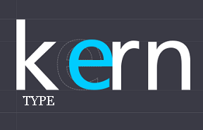
 It's always intriguing when a game developer takes a technical, even mundane, activity and makes it into a competition. Take kerning, for example: the process of adjusting the spacing between characters in a proportional font, usually to achieve a visually pleasing result... or at least that's Wikipedia's take. Anyways, KernType, a unique puzzle game developed by Mark MacKay for education site Method of Action, charges you with just that: click and drag the middle letters of a given word for a given font to make it aesthetically perfect. Your result will be compared against a professional typographer's, and you will be given a score based on how close you get to their solution. It's not a concept that survives multiple plays-through, but it's quirky fun and a compelling showcase for the beauty of text. Oh, and your friendly neighborhood game reviewer managed himself an 81/100. Beat that, you wingdings.


83/100
And then 92/100
HA.
... Touche.
I am a professional graphic designer
and I got 95 / 100 on first try
HA! :D
Ack, it's saying my browser isnt supported, time to download internet explorer 9!
Apparently I have IE9 already downloaded.. and it's giving me a browser not supported error.
... I disabled compatability view on IE9 and it works now..
Whoa I can't believe I got 94! Will be interesting to see everyone's results so I can check whether my eyes are as sharp as I now, proudly, think they are.
90 out of 100. I was doing quite well, until I got 42 on the last word. I was at 95 for the first 9 words. Alas!
I got 100/100 on a few words despite there being an obvious difference between my spacing and the solution... bizarre. Unfortunately I had a terrible overall score because I was very hit-or-miss with the puzzles ;P fun game!
Not to brag or anything, but 100/100 on number 3 (the text that says "holly"). Hells yeah.
Though my highest on the ones before that was like 75... go figure, I didn't think you'd
nest a lower case y under a capital T a little. Aren't letters - both digital and printed - isolated into their own little individual spaces?
But I digress.
My final score was 88/100
I got 100/100 on 5 of the puzzles though, which tells you how terrifically bad I did at the other 5...
87/100. Pretty happy with that!
Got 100/100 on 4/10, 'Await'. *buffs nails*
Being currently enrolled in a drafting class, I find this rather interesting. I got a lecture on spatial relationship the other day, and going by spatial relationship I got a 62/100. Fail Mr. Howden. Kinda boring after 5 words or so, though.
94/100. I got a horrible 59 on one, then I aced the rest. I guess I have an eye for kerning, once I know what I'm doing?
100/100! :D
@Tricky: Let's not insult the fonts, 'kay?
i got 59/100 overall not knowing what to do
CyberJar, I would never insult any font... with the possible exceptions of Comic Sans, Papyrus, Jokerman and Monotype Corsiva... friggin' Monotype Corsiva.
91/100 on my second try! :D wewt
And then 100/100 on the 3rd one. ^-^
97/100, first try!
@Procrastinateher: In digital typography, you can draw the letters wherever you want, and fonts have special rules for kerning pairs, pairs of letters that can be squashed together like that. In metal typography, you could either combine two letters onto a single piece of type, or you could cut into the side of a block of type so that another letter could fit into that space.
The exception is a "monospaced" font, where each letter takes up the same amount of space. This is useful for fonts used in programming.
Source: Wikipedia: http://en.wikipedia.org/wiki/Kerning
89/100, first try.
I got 100 on (if I counted right) 7 of the puzzles, and final score was 95.
And I would love Papyrus, if only it didn't have that stupid distressed look.
I did gargantuan absolutely perfectly. There wasn't even a sliver of a pixel visible on any of the letters. Beat THAT!
Even though Kerning is really boring, this game is amazingly boring.. Wait, maybe that's not amazing after all.
It is a well presented game but it's not for everyone. I'm glad a lot of people here are enjoying themselves with it (after 3 rounds I wanted to kill myself)
hahaha...Diego, you crack me up.
Procrastinateher, I had that same problem--my lowest score. And the thing is, I knew better--it certainly LOOKED better nested, but I second guessed myself.
One thing I couldn't figure out was whether the radio buttons did anything or not. In Chrome, they had no affect. I would have liked to see the solution vs. my placement without the blue underneath--the way I design, it makes more sense to me, and I thought that's what they would do, but apparently not. Maybe my browser? Maybe a bug?
87/100
Needs more levels ;)
got 93/100 on my first try. Not bad for a truck driver...maybe i'm just good as judging distances..? now do i tell my graphic designer wife...
In addition to showing the correct solution, the game could benefit from explaining the principles involved.
In some levels, I got one or two letters dead-on perfect while the other letters were way off. :-P
My seventh-grade English teacher LOVED Garamond. Seeing so many documents typed in that font probably helped me get 100/100 on that level.
94/100 B)Thank you Mass Comm class. I know nothing of AP style or design but at least I can kern.
100/100 on Gargantuan. Now that's nice. My overall score? 63. Now that's NOT nice.
well i only got 71/100 but im also only 13 so i dont think i did too awful. i think this game would have been better if there had been something midway to give a short break from teh boring background and non-existent soundtrack. but it still wasnt a bad game.
85/100, and I did get a few perfect scores :).
96
Update