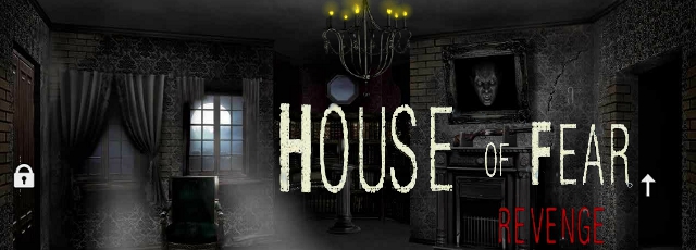
![]() ViDi Games' point-and-click adventure House of Fear: Revenge offers no explanation for why you're loitering around outside this gloomy place on a snowy night, nor why you immediately feel motivated to start smashing things and breaking in. Maybe you're role playing as the person who dies first in a horror movie to clue the main cast in that something strange is going on? You can go ahead and feel justified in your felonies and property destruction, however, as it quickly becomes obvious that there's some serious Scooby Doo business afoot here, so you should probably explore further. There's no changing cursor to indicate interactive areas, so you'll have to click to pick up items and explore on your own. Clicking the square in the bottom left corner will open your inventory and its many buttons... click to highlight an object you're carrying, then again on whichever icon corresponds to the action you want to perform. The magnifying glass allows you to examine objects more closely, while the interlocked puzzle pieces will let you try to combine two items, and the separated puzzle pieces are for disassembly. If you actually want to use an item somewhere in the game, you need to click the hand icon once you've highlighted it. Maybe this place is haunted by the spirit of clunky User Interface design? Wooooooooo!
ViDi Games' point-and-click adventure House of Fear: Revenge offers no explanation for why you're loitering around outside this gloomy place on a snowy night, nor why you immediately feel motivated to start smashing things and breaking in. Maybe you're role playing as the person who dies first in a horror movie to clue the main cast in that something strange is going on? You can go ahead and feel justified in your felonies and property destruction, however, as it quickly becomes obvious that there's some serious Scooby Doo business afoot here, so you should probably explore further. There's no changing cursor to indicate interactive areas, so you'll have to click to pick up items and explore on your own. Clicking the square in the bottom left corner will open your inventory and its many buttons... click to highlight an object you're carrying, then again on whichever icon corresponds to the action you want to perform. The magnifying glass allows you to examine objects more closely, while the interlocked puzzle pieces will let you try to combine two items, and the separated puzzle pieces are for disassembly. If you actually want to use an item somewhere in the game, you need to click the hand icon once you've highlighted it. Maybe this place is haunted by the spirit of clunky User Interface design? Wooooooooo!
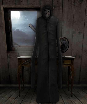
 For the gentle souls around us, fear not... House of Fear: Revenge is only a "horror game" with finger quotes around the word, likely only to terrify if you find the old fun house rides with rubber skeletons and spooky noises scary at state fairs. The scariest thing about it, actually, about from its overly clicky inventory system, is the way so many of the items you need to gather are small and drab enough that they blend into the background. It's an incredibly ambitious game, with its beautiful visuals and surprisingly meaty chunk of gameplay, and for the most part puzzles that make sense and are even clever... if you know where to look. If the game provided some more gentle nudges to make up for how dark and occasionally unintuitive some of it can be, it would be a lot stronger for it without sacrificing design for difficulty. There's a lot to like here, from the creepy-cool creatures you'll encounter, to the plethora of puzzles, clues, rooms, and more, all rendered in beautiful detail. It's also clear the development team has a lot of talent, and hopefully we'll see a lot more from them in the future as they incorporate feedback from the people who matter most... their players. You'll need patience and a keen eye to play, but despite its missteps in design, House of Fear: Revenge has a lot of potential. And skeletons in the closet. And murderers in the attic. And giant angry flame beasts. Why was coming here a good idea again?


I had to find a walkthrough to learn that one object was supposed to be a bullet (or, actually, a shotgun shell) -- I was thinking it was a battery. The game contains the old "if something doesn't work, just do it again a bunch of times" puzzle (although in the game's defense, there is another way around that puzzle). I quit on a puzzle where, even after seeing the solution, I don't know how I was supposed to get there.
Sorry authors -- professionally done, but not fun.
Interface, terrible.
Also objects should stay with you until they can't be used anywhere else. Apparently I used the pickaxe either too early or in the wrong place, according to that walkthru.
Once I saw that, I stopped playing.
This is a beautiful game. The graphics are awesome and it's very challenging, but I had quite a few issues with it that ufortunately overshadowed the artwork.
It's an interesting idea to
have the ability to use any of the weapons to kill any monster
but it sometimes got confusing, specifically when
there were suddenly specific things you had to do to kill the ghosts, and nothing else worked.
The whole game seemed sort of disjointed- there were several ways to get certain items or get into places, some of which were completely unnessecary. There wasn't really any order to things, which isn't nessecarily bad in some cases, but you should not be able to solve a problem by accident before you even get to the point where you'd need to solve it. For example,
I didn't even know there was a second ghost in the mirror reality until I watched the walkthrough because I solved the puzzle way too soon. I got the scull early on and had no idea what to do with it, so I randomly decided to try burning it. It worked and I couldn't figure out what the purpose of it was until I got upstairs and found the clue showing what to do with it, then watched the walkthrough and saw the ghost. Before that I just assumed the clue was for the other ghost- the one in the attic- and thought I'd missed something. In the clue
the scull was pictured with a pair of crossbones going into the fire, and I thought I needed to find those and burn them too. The crossbones don't even exist in the game, at least not as an obtainable item, so I searched and searched for them before giving up and moving on to something else.
It would have been easy to get rid of the possibility of confusion here- for example the scull could have only been burnable in the mirror universe fireplace. It's pointless for you to be able to burn it in the downstairs one, because you would have to either go out of your way to get there when the other one is much closer, or have found it by accident like I did and have no idea what was going on.
Something like this was possible in many cases, and got really confusing because it seemed like a lot of things you had to do were completely pointless.
Someone above mentioned that items- like clues- should disapear from the inventory or be faded out when you've solved their respective puzzle, and I agree. It gets confusing and cluttered when there are too many items that can't be used anymore in the inventory.
Another thing- did anyone figure out the purpose of
the telescope that was pointed at the moon? I don't think it was a part of any puzzle, although I could have just missed it.
and
the locked door in the television universe? I couldn't figure out how to unlock it even though I finished the whole game.
@GuyWithLinkAsName: You have two options for where to use the pickaxe. Neither is wrong. It just governs which door you get in through and how you kill that one skeleton. Everything else is the same.
@ccruf3: There is no television universe. There are just two tvs in the house, and you can teleport from one to the other. Both rooms with tvs in them are on the first floor and have a locked door. You can use the pick on whichever of the two doors you like, but the other will remain locked, and you'll only be able to get to it through the tv in the other room.
no hurry but i hope a walkthrough will be here soon :)
this board is going back to not posting in ie again. i had to go on google to post the above message. i hope someone can look into this.
How are you supposed to know the code for the globe? I read it in a walkthrough but it didn't explain why
80 20 50 turns into
508020
Love the graphics, hate the interface, and the story makes no sense to me. I eventually resorted to the (annoying video) Walkthrough, and it made even LESS sense. Not very many "ah-HA!" moments, and in the end more irritating than fun.
It has nice graphics but unfortunately that's it...
Update