![]()
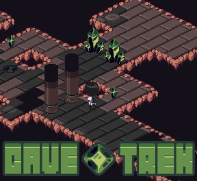
 Sometimes you feel like a puzzle, sometimes you don't. When you do, there's Cave Trek, an isometric game light on story and heavy on brain-seizing mazes. Your goal is simple; get to the exit at the end of each level and proceed deeper into the caverns. That's it; there's no story given, no real motivation. Why are you in the cave? What possible treasures could be worth all this trouble?... Do... do you think it's banana muffins?... oh my God, you guys, I bet it's totally banana muffins! I love banana muffins! Last one down's a rotten egg!
Use the [arrow] keys to move around. The idea is that the exit will only open up when you've made all the light coloured tiles drop off the screen, which happens once you step off of one and on to the next. Easy, right? Well, then, how about the traps? After a certain number of tiles have fallen, pillars will spring up from holes in the ground, barring your way or obliterating you if you happen to be standing on one. Oh, and of course there're the green crystal formations, which can only be removed once you've collected all the smaller crystals. Then, of course, you have various colour-coded switches to contend with... but we're sure you'll have no problem with any of that. Right? Gravy.
The problem is that there's really no way of knowing when the trap pillars will trigger, so each level involves a certain amount of trial-and-error. And while it's well made and cleverly designed, it's also a one-trick pony. There just isn't a whole lot of variation to the levels, well designed as they are, making Cave Trek the gaming equivalent of a book of crossword puzzles. For some people, "congrats, now do it again, but harder" isn't going to be a sufficient reward for their time spent sweatily glaring daggers at their computer screen.
But while it undoubtably could have been bigger, more fleshed out, and more elaborate, that doesn't necessarily mean it should have been. If what you want is pure, uncomplicated puzzling, Cave Trek will provide it in a tiny but polished little package. Even with a lack of variety, it offers up a satisfying challenge with adorable aesthetics, which we're sure will give you a lot of comfort the umpteenth time you trap yourself in the corner.


It was a neat little puzzler, but I hated how much of a pain it was to see the distinction of the tiles. If they were plain squares, then I could map out a path, but the staggered rectangle pattern made it almost impossible to look at and know where you need to go. Level 4 would be the earliest example of this. Other than that I thought it was pretty clever, nice and puzzle-y!
Hmm.. it's like those floor-dropping puzzles from DROD, only in much less user-friendly isometric style (for this kind of puzzle) and with no smiting whatsoever.
The presentation is ok, though.
Ugh, isometric, how I hate it! There might be a decent DROD-like in there but isometric makes it too user hostile to be worth persisting. Having two image tiles for each logical tile is annoying, and so is the poor choice of colours. Sort all those things out and it might be worth another look. Meanwhile, it's back to helping Beethro for me.
Wow, they really went out of their way to make level 10 as frustrating as humanly possible, didn't they? I was enjoying it up to that point.
Not loading for me. I get a loading screen, once that hits 100% I get a loading bar and an advert (an annoying trailer for Camp Rock 2) which doesn't go away: the only thing I can click on is the whole-game advert. Reloading the page made no difference.
[What are the browser/os/flash player versions you're using? -Jay]
Had to play this since DROD was mentioned, but no... I'll stick to DROD :)
The lack of an undo button (at least just one move), the fact there's a bug where it's possible to "jump" over a red tile if you're moving relatively fast and the fact drop gates don't have a number of tiles above them to indicate how many tiles remain before they drop (to allow *some* strategy) all mean that I won't play any further... even though I like the genre
The font on the title made me initially think it was "Grue Trek". It was not.
A fun idea with cute graphics that is needlessly difficult to play. One point of DROD (since it was mentioned in the comments) was that the extremely simple graphics made it extremely easy to see where you were and what was around you at all times.
The puzzle, the level design, these were all wonderful. The scrolling screen made it difficult to follow the action when you're planning a course. The isometric design and odd tile shapes made it difficult to plan out your course. If the game were changed to a top-down perspective it would be vastly improved.
Just had to comment, also, to point out that the logo looks more like "Grue Trek". Maybe it's intentional- wouldn't the C have an entirely open right side? And that's an unconvincing V.
I was so dissapointed when I
Got past the boss on level 10, killed it and obtained the drill from a chest...and the game ended
Cmon. The first real challenge and it's over. No new levels with a fun new toy?
I give levels 0(Tutorial) - 9 a 5/5 rating, but overall drops to 3.5 because of level 10.
Arrow keys do not do anything.
I also experienced the same problem as John Blackburne (the "skip add" button doesn't appear) but it went away after a refresh.
Flash 10.1.82.76
Chrome 6.0.472.59
OS X 10.6.4
Update