 Tringo is an addictive puzzle game concocted by Nathan Keir in the beautiful bizzaro-world Second Life. Originally designed for use in-game to gamble for Linden dollars (L$), Second Life's currency, Tringo soon exploded in popularity and now appears on Nintendo's Gameboy Advance and the Web via Adobe Flash.
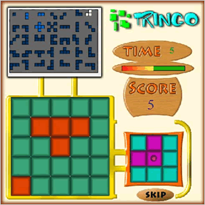
As the name implies, Tringo's rules are a mixture of Tetris and Bingo. Arrange a series of shapes on a 5x5 grid and earn points by constructing blocks of 2x2 or greater, which are then eliminated. Each turn lasts 10 seconds, and 7 points will be subtracted from your score if you don't manage to place a piece in time. You can also click the Skip button to begin the next turn immediately. The window above the playing field shows all possible shapes, each of which appear only once per game. The current shape is white, light blue shapes have already been placed, and dark blue shapes have not yet appeared. The window to the right shows the current shape with a circle on one of the blocks it is made up of. This is the origin point; this point of the block will appear in the grid cell you click with the mouse when placing your block.
Analysis: I haven't tried Tringo on GBA, but the web implentation is rather poor and feels awfully rushed. Asking the player to refer to the origin point for each shape is needlessly confusing and absolutely unnecessary. Floating an image of the piece you're currently placing on top of the mouse cursor would have been far simpler. Tringo also might benefit from adopting Tetris' piece preview feature.
Faults aside, Tringo is an intuitive, solid puzzle game with an interesting history and, with a board game and UK TV program in the works, a bright future.


I thought that the game was quite enjoyable once you figured it out. I agree with you Noah in that floating the pieces would have made things much simper, but I also think that it would be better if you could select one of the pieces in the above window and thus incorporating some kind of stratagy. Other than that, I enjoyed the game, though tetris has always been one of my favorite "time-waster" games.
So this is what all the fuss was about. Decent game. I kind of wish it were possible to rotate the pieces (if you can, I couldn't see how).
deliciously addicting.
Scrappy scrappy scrappy. No skinning of text input, an explantion page [where a 2 second animation would have done the job better], Terrible buttons, minimal sound use that you cant turn off, and even the splash banner for the game displays bad compression artifacts.
this comes across like beginners submission on newgrounds, and not at all like it was put together by a professional.
Seriously underwhelming implementation of what could be fun.
Ok, Heff, so are you saying then that a game has to look pretty to be fun?
This game could be fun, but the uglyness just is so "loud" that you can't ignore it. In this case, I belive that the game doesn't have to be prettey but it does have to be somewhat polished.
Harrumph - I found this miserable, rotten, terrible game as addicting as hell. Sheesh! You didn't tell us that was going to happen! LOL
FGM
Arnos - I think you're saying the same thing Heff is.
Personally, I can ignore the ugliness because the gameplay is quite fun and rather addictive, as danielle and fairygdmther pointed out.
That being said, the interface, as Noah mentioned, could have been done better. I would have liked a floating piece to place rather than clicking one 'special' square that I had to keep referring back to the image on the right to figure out which one it was.
Also, the points and scoring system needs an overhaul with a global high score list, too.
Maybe we could talk Nathan into allowing us to do a better version of it for the next Game Design Contest?
Arnos, Heff: I pretty much agree with all your complaints. I had grave misgivings about posting Tringo, especially since I really do appreciate games with style. Still, I got hooked and figured it was worth sharing, despite the glaring flaws. The fact that Tringo manages to be fun when the implementation leaves so much to be desired is a sign that it is a good game, deep down =]
Jay: A global high score list would be great. like you said, the scoring system would need a great deal of refinement. Any ideas? Maybe pieces on the grid could be worth less points as time goes by.. or, each turns' 10 second timer could determine how many points each piece is worth, providing an incentive to place blocks as quickly as possible.
Addicting, and not the worst design I've seen in a game. However, I feel that blocks larger than 2x3 or 3x3 ought to count towards your score. I was pumped when I saw that I could make a 2x4 block, then disappointed when it only took away the 2x3. Also, if you complete a shape that consists of more than one block, for example:
xxx
xxxx
xxx
both 2x3 blocks should disappear.
These are things that I thought would be pretty instictual for any game player, so I was surprised when they did not happen.
that bothered me, too, zxo. i wonder if some of the limitations of Tringo are due to limitations of its original platform, Second Life.
I was wondering how the hell I got my top score of 228, but I just beat it with a score of 260.
I got it last game and not this game; the rare 3x3 will grant 30 points.
The highest score I managed to get was 263, but the game is pretty addicting, that's for sure!
While this single-player Tringo is enjoyable, I'm sure there's much more fun to be had with the original multiplayer format, in which each player is dealt the same pieces at the same time and the highest score wins.
Another note: the game won't notice a 4x4 either.
If you're wondering (as I was) you can fill in the entire 5x5 square. Just hope that the "X" piece comes late. But don't bother -- filling in the entire box is only worth 65 points :-(
Managed to get 285 :-)
As per comments above this needs reworking to be good as a single player game.
Scoring should be based on the number of squares made
So
XXX
XXX = 2sq
XXXX
XXXX = 3 Square
XX
XXX
XXX = 3 Square
XXX
XXX
XXX = 4 square
XXX
XXXX
XXXX = 5 Square etc.
I suspect that the square of the number of squares would give a reasonable scoreing pattern. 1,4,9,16,25
I would multiple the score by the number of "seconds" left. So that an "instant" 1 square would give 10 points and a slow 5 square could give only 25.
I say "seconds" as a difficulty setting could determine how fast the "seconds" are, also there could be a delay before the first second "ticks"
The -ve points for passing should also be proprotional to the amount of time taken to pass. Passing quickly looses only a few points, passing late (or not acting) looses lots. So basicall take a big number and divide by seconds left.
Oh one extra thing I would add is a bonus for clearing the screen of bricks.
And a tetris style "next brick" indicator would be good (possibly a different play mode)
Finally multi player definaly seems like the way to go with this. Preferably 4+ player where you can see the moves of other players as they make them (with a slight lag :-) As per the orriginal give all players the same set of bricks in the same order.
I won't comment much on the interface as I am no expert, but i actually liked the "center birck" method and found it simple to get used to.
Nice game though :-)
Jarak
Bah one more thing there should be another (smaller_) penalty for trying to put a brick somewhere that it does not fit.
Jarak
Jarak, I think thats not really needed
Anyway, I found this game to be truly great. Its something really worth getting for under a tenner on gba I think. Its just still a bit clunky to carry it around and play it on a ds ( or ds lite). I just need a micro really.
Im sure it'd be fun, but really. Its like connect four; Fun, but not fun when you're trying to play it wearing oven mitts.
Its not that games need to be pretty to be worth playing, but they do need to be implemented so that the interface and overall 'feel' doesnt detract from the actual game itself.
I'm working in a Call Center on a graveyard shift and i'ts really boring. This game just keeps me awake.
I wasn't taking this game seriously. like I said "just to keep me awake". I never thought that I'm the highest scorer amoung us, coz I got 270. Anybody can top that?
Now, I just got 268.
280. Good game.
I got 280 too!
It took me a long long time and many tries, but got my all time high score of 295!!! My highest up until that was 275. You have to take a lot of risks and you end up with a lot of games with very low scores because you had nowhere to put a block at all. To get the highest score possible try to make as many 3 x 3 blocks as you can. GOOD LUCK!
okay, folks... good news and bad news... good news is, for those of you who complained about the game being ugly, the game has been updated... now you've got a nice futurey theme to gawk at. and lots of beepy sounds.
bad news... they haven't done a thing to fix the bigger-block thing. the only blocks you can register for points are 2x2s, 2x3s, and 3x3s. don't ask me how, but i actually managed to get a 5x3(!)... well, let me show you...
you take this:
XXX
X X
X X
X
XXX
and you add this:
X
X
XX
and what do you get?
15 points. it clears the whole thing but it registers it as clearing a 2x3 block. what the heck.
i'll admit, i play this game every once in a while just for something different, but they really need to fix a lot of technical stuff on here. sprucing it up visually isn't worth much if the game still doesn't play right.
If you like Tringo then you should like Comblo. Go to http://www.comblo.com or just search for Comblo in Google. Comblo includes the Tringo block set as one of its options. But the scoring method is quite different; you can replay the same sequence as often as you like; you can see the full sequence of blocks as you play; there is no time limit; you can walk through each of the plays that created top scores; you can play it on your Wii (for which it is optimised) - and much more - all of which is detailed on the Comblo Web site.
I just got 332, can anyone beat that???
This game is really enjoyable and addicting. I just spent an hour trying to top my previous scores, and the highest I got was 503!
Update